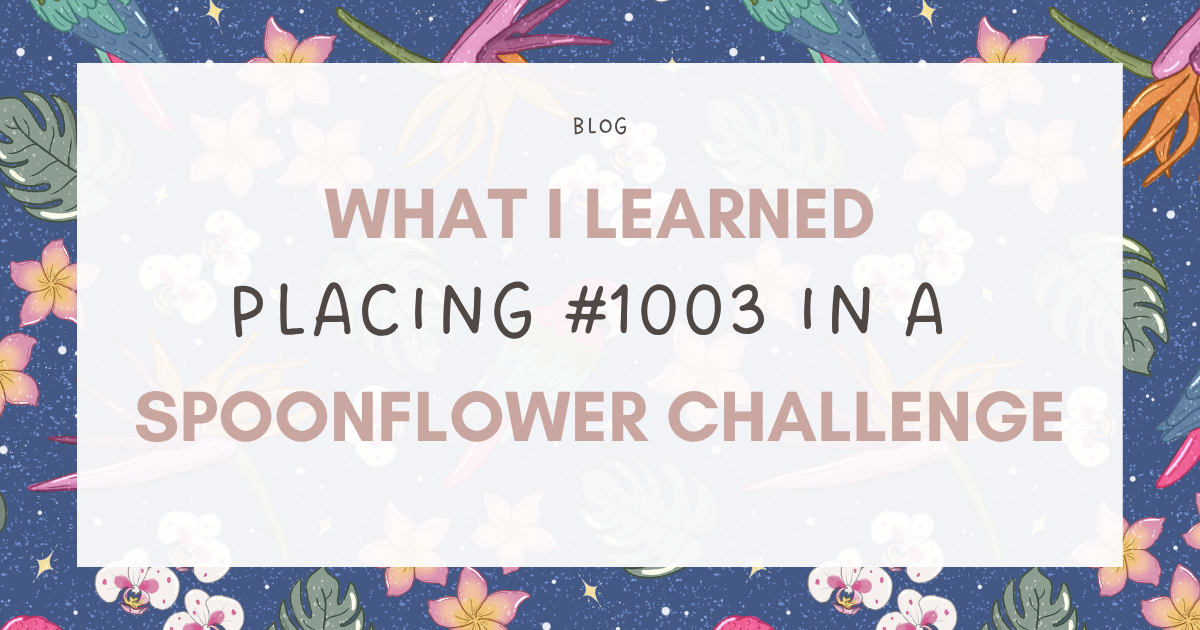
What I Learned from Placing 1003rd in a Spoonflower Challenge (Ouch!)
I recently entered Spoonflower’s Hothouse Florals design challenge and placed 1003rd out of 1402. So, you know... Nailed it. 😅
Honestly, when I first saw the results, it stung. And I was honestly a little shocked. Not because I expected to win by any means, but because I genuinely liked my entry, I thought it was a strong interpretation of the brief through my lens, and it’s always a little weird to really like something you made and then see it land so low in the ranking. It makes you question things for a minute, you know?
Like… Is my work not as strong as I thought? Or did I completely miss the brief? Am I just off in my own little world while everyone else totally understood the assignment?
Maybe a little. 😂 But the more I thought about it, the more I realized there’s actually a pretty important distinction here.
I do think it matters to read a brief carefully. A lot. If you’re designing for a client, a licensing partner, a fabric customer, a product line, whatever — the goal is not just to make something pretty that you think people will like. The goal is to understand what the client is asking for, what the end use is, who the design is for, and what problem the artwork is supposed to solve. That’s design.
You can’t just skim a brief, decide what you think works for you and run off in a completely different direction. Well, you can. But you probably won’t deliver what the customer actually wanted and you probably won’t get hired by that client again. So yes, clearly understanding the brief matters.
But I also think Spoonflower challenges live in this different category that’s less important. They are briefs, yes. But they’re also portfolio prompts. Creative exercises. Visibility opportunities. A reason to make something new. A way to practice designing within a theme. And because of that, I don’t think the goal really needs to be “how do I make the most Spoonflower-challenge-perfect version of this theme?”
Sometimes the better question is “how can I respond to this theme in a way that still belongs in my portfolio?”
Because for me, Hothouse Florals did not immediately make me think “bright jungle novelty print.” It made me think moody botanical gardens. Conservatories. Palm Beach hotels. Tropical flowers behind glass. Humid air. Patterned wallpaper. A little bit dramatic, a little bit vintage. And my lane tends to be more kid-friendly, so I interpreted the prompt through that lens.
Could I have made it bolder? Yes.
Could I have pushed the vibrancy more? Totally.
Could I have made something more obviously playful, more saturated, more instantly readable in a voting grid? Definitely.
And maybe it would have ranked better… But would it have been a better fit for the kind of work I want to keep making? Maybe not. And that’s the part I keep coming back to.
Because I don’t want to build a portfolio full of designs that only exist because I was trying to win a contest. I want my work to feel like it belongs together. I want it to help people understand what kind of designer I am and what kind of work they can come to me for.
I think it’s important to learn how to interpret briefs well. But I also think it’s important to know when you’re designing for a customer… and when you’re designing for your own body of work. And those are not always the same thing. In client work, the brief leads and your style follows, but in portfolio work, your style and long term direction should lead.
So maybe my Hothouse Florals entry could have been more “brief perfect.” Actually, I’m certain it could have. But I still like the direction I took and I’m still proud of my entry. I still think it makes sense for my portfolio, even if it didn’t make sense for the voting crowd. And that feels worth paying attention to because not every design has to prove itself by placing well in a challenge.
Sometimes the better question is whether it’s helping you become more clearly yourself.
Until next time,