10 Do’s & Dont’s for Designing A Cohesive Collection
Creating a cohesive collection is kind of like building the perfect playlist. You want variety, you want flow, and you want that satisfying sense that everything belongs together. The easiest way to get there is to follow a few simple do’s and don’ts that keep your creativity focused but still fun.
Grab your coffee. Let’s get into it.
The Do’s
DO keep your color palette consistent
Pick a palette and let it guide everything. When your colors stay steady, the whole collection instantly feels unified.
DO repeat your key motifs
If your hero print features florals, berries, pine branches, or whatever your theme is, let those same elements show up again in your secondaries and ditsies. This gives your collection a clear heartbeat.
DO design prints that compliment each other
You want contrast. A bold hero, a few medium complexity prints, and some subtle supporting ones. A little ebb and flow is what gives the collection life.
DO mix up your pattern scale
Use a range of large, medium, and small motifs. It keeps everything balanced and makes the collection more practical for sewing, quilting, and apparel.
DO include supporting prints
You need the calm ones just as much as the exciting ones. They make the heroes pop and help buyers envision full projects.
The Don’ts
DON’T change your palette halfway in
If a new color feels irresistible, that’s usually your next collection talking. Save it for later.
DON’T drop in random motifs
Yes, they’re super cute, but they don’t belong in this story. Save them for another collection.
DON’T make every print the same density
If everything is busy, the eye gets overwhelmed. If everything is sparse, the collection lacks energy. Variety is your friend.
DON’T design everything in isolation
Look at your collection as a whole while you work. Adjust as needed. One new pattern can shift the entire rhythm.
DON’T overload the set
More is not always better. A streamlined, thoughtful group is stronger than a giant one without direction.
Types of Prints and What They’re Actually For
Here is a friendly breakdown of print types and how they function inside a cohesive collection. Think of this like casting roles in a movie. Each print has a job.
Hero Print
Bold, detailed, full of personality
Sets the theme
Carries the story
Usually the first thing people fall in love with
Great for dresses, quilts, duvet covers, larger statement pieces
Secondary Print
A little less bold, still very interesting
Supports the hero theme
Adds variety and depth
Works well for apparel, quilting blocks, smaller home goods
Ditsy Print
Small scale, cute, repetitive, very usable
Perfect for children’s clothing
Wonderful blender for quilts
Great for lining fabrics, accessories, and little handmade items
Tonal or Blender Print
Soft, low contrast, often one or two colors
Gives the eye a place to rest
Helps tie the palette together
Works beautifully in quilting, backgrounds, apparel trims
Geometric or Structured Coordinate
Stripes, checks, grids, simple geometrics
Adds structure and balance to organic motifs
Very usable and timeless
Helps diversify the collection
Near Solid or Texture Print
Barely there pattern, simple texture, light movement
Great filler and balance
Gives makers flexibility
Makes the whole collection feel more complete
When you blend these print types with consistent colors and motifs, you get a collection that feels intentional, versatile, and ready for real world use.
Cohesive collections are all about rhythm. Some bold. Some gentle. Some tiny. Some sweeping. A few repeats. A steady palette. A clear story.
Once you start thinking in terms of roles and variety, the whole process becomes easier and way more enjoyable.
Want even more? I put together a free 7 page mini-guide detailing how to put together cohesive collections, breaking down The Basic Anatomy of a Collection. Download it for free below.
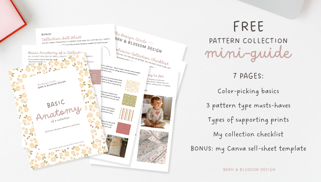
Download my free min-guide and learn the basic anatomy of a collection. Click the button below to learn more.